Looks like the Toronto Raptors are going in a new direction, with the help of Drake of course
Last year, the Toronto Raptors unveiled their 20th anniversary logo patches that will be apart of next year’s home jersey’s and it looks like the organization has officially taken another step in re-branding themselves. As part of their “We The North” campaign, the organization released a video celebrating their new team slogan and in addition revealed the teams new logo.
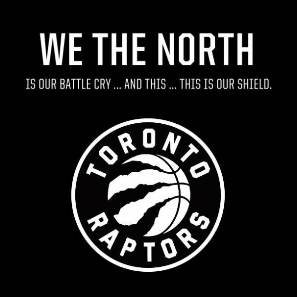
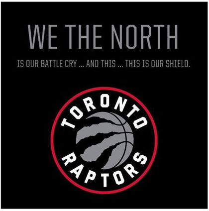
Going into effect next season, the new logo features a ball with claw marks inside a red circle with “Toronto” above and “Raptors” below. Different from the first logo revealed today that was mainly black and white and similar to the Brooklyn Nets Logo, the colorized photo below is the official logo for the 2015-2016 season. Check out the official video for the trailer above.
Guess it’s so long for the “original” Raptors logo. What do you guys think of the new one? Yay or Nay? Talk sports and why Drizzy took over 2014 with Drew on twitter @Drewtheabstract.

